1937–2011
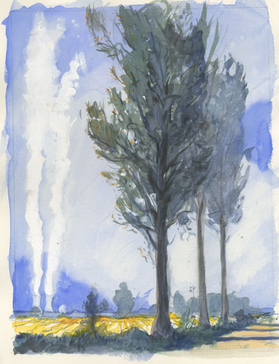
Peter Campbell, who died on 25 October, was resident designer and art critic at the London Review of Books and, from its relaunch in 2000, the designer of New Left Review. Campbell was contacted by Perry Anderson, returning as editor to undertake the renewal of the journal in a conjuncture transformed by the West’s Cold War victory. nlr’s layout had remained virtually unchanged since Derek Birdsall’s formulation of it in 1964, with broad, asymmetrical margins and bold horizontals on the cover. Campbell recast the typography, using big Bodoni drop caps and a range of delicate, upper- and lower-case Scala fonts. At the editor’s suggestion, he drew the journal’s initials in broad, sweeping brushstrokes, using them to frame the landscape of the journal’s contents and writers on the front cover; bringing them together as a unified statement on the back. Formally distinct elements—calligraphy, letter-press fonts, combinations of colours—were brought into effortless harmony, yielding an endlessly variable but utterly distinctive design. Campbell was born in 1937 in Wellington, New Zealand. He would recall the wooden houses, perched like birds on the precipitous hills that encircled the harbour; and the brightness of the light, bouncing off the surface of the ocean. His father was New Zealand’s Director of Educational Research and Peter grew up with ‘the faded red spines of the Left Book Club and the blue volumes of Scott Moncrieff’s Proust’ on the shelves—‘reading, drawing, walking’, as he wrote in the London Review. At Victoria University, in the late 1950s, he managed to combine a Philosophy degree with English and Geology; and at the same time undertook an intensive apprenticeship, as typesetter, compositor, designer and illustrator, at the poet Denis Glover’s Wingfield Press. He set sail for England in 1960 with his bride Win Doogue, and worked for the next fifteen years for the bbc, designing its books and its house journal The Listener, which forgathered the team that would later found the London Review. ‘As much as the original editors,’ Mary-Kay Wilmers would write, ‘Peter shaped the lrb.’ Paradoxically, his watercolours—landscapes, occasional figures, forgotten corners of domestic life—would bring a particular Englishness to its covers; perhaps because the artistic and intellectual culture of New Zealand, where poets would write art criticism and set type, while theorists and historians manned the presses, was closer to one that had been a vital current in English life, from Morris’s Kelmscott to the Hogarth Press, yet had all but vanished long before the end of the Thatcher era.
Practitioner-critics ask different questions to those of critics tout court; their starting point is more likely to envisage the work in prospect, the manifold problems presented to the artist at the moment of its conception and the tools available for their solution. Campbell’s writing on art—above all his fortnightly ‘At the Gallery’ pieces in the lrb—combined an inexhaustible curiosity about artists’ motives and strategies with a strong sense of art’s material and technological history. In the early Renaissance, he noted, at an exhibition of quattrocento drawings at the British Museum, ‘paper was expensive and vellum more so. The drawings tend to be small and nothing is wasted—variations or new subjects are often found on the other side of the sheet or in unoccupied corners. Painters kept hold of drawings so that an unfamiliar thing, a cheetah say, or a difficult one, such as a gesturing hand, or even whole figures, were there to be reused—drawings were tools of the trade.’ With the spread of printing, paper became cheaper and books could supply ready-made reference material. ‘Drawing began to change. It became less necessary as a workshop resource, more important as a vehicle for exploration and invention.’
The same breadth of historical and cultural comparison might be applied to modes of travel, fashion, architecture, town planning, plants and trees. Writing in these pages on the Brighton Photo Biennial, Images of War, Campbell tracked the craft of battlefield photojournalism from its birth in the Crimean and American Civil Wars to its apotheosis in Vietnam; by the 1960s, however, the iconic still photograph was already losing out to the immediacy of television. ‘Come Iraq and you are in a new technical environment. Endless images flow from both sides.’ The work of professional combat photographers is challenged by a mass of ‘uncomposed’, ‘artless’ pictures from American soldiers’ phones: ‘the quality of their flash-lit messiness is something we recognize from the pictures of last night’s party or girls out on the town—the most disturbing images of the war are cousins to those that sit in our own digital cameras’. As a result, the great photojournalistic images ‘that seemed to offer unmediated truth are, one now sees, exercises in visual rhetoric, using compositional habits and telling gestures that can be tracked back through Goya or Delacroix. They are true in their own way, touching and wonderful, but not visually innocent.’
Campbell’s residency at the London Review was spiritual, not geographic; his studio was in Judd Street, where Bloomsbury shades into King’s Cross. His arrival at the nlr office, to choose the issue’s cover colours or sort out its typographical dilemmas, was a high point of the journal’s cycle. Tall and sweeping, a twinkle in his eye, he would often be stopping off at Meard Street en route to the National Gallery, a catalogue under his arm. He could judge a page with a draughtsman’s eye, assess the margins or place a running-head, insisting on ample ‘thumb space’ down below. In his seventies he seemed untouched by age; he would have had years ahead of him, if not for the onset of cancer. His work lives on, in the collection, At . . ., of his gallery pieces from the lrb; in a forthcoming volume of his paintings; in the letters on the pages of this journal.
